 |
| Dedicated Top-Shelf Display, via Kevin Hennah |
In planning our new library, one aim was to increase circulation through better "merchandising" or "selling" of what the library has to offer.
We hired Kevin Hennah for a virtual session to help our design process and explain some key elements:
- Front-facing books
- Signage
- Flexible shelving
- Genrefication
- End display spaces
Having heard Kevin at a conference several years ago, much of the talk included concepts I have used in previous libraries with good results. The bonus for me was that our admin and building design team also heard the same messages.
 |
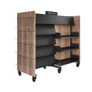
| Dedicated side and front-facing display, via Raeko |
When the shelving arrived, we unpacked by filling each shelf 3/4 of the way, leaving space for 1-2 front-facing books.
With the slanted display space on top it looked great. I was happy with it.
But I shortly made a big change due to some....
Extremely-Mini Action Research
We are an open library (zero doors!) so I leave the space extra tidy to be able to notice if anyone has been there after school. We always end each day by filling the empty display spaces. Since we were doing that anyway, I figured, let's COUNT how many books are coming off the displays each day.
For a week, we did a daily count of our empty display spaces and compared it to our circulation data. We discovered that 35-40% of our circulation came from displays. This was true on days with high circulation from a class coming in AND on days when circulation was lower.
With this clear evidence of the importance of display space, I decided to see if I could maximize the display space even more.
 |
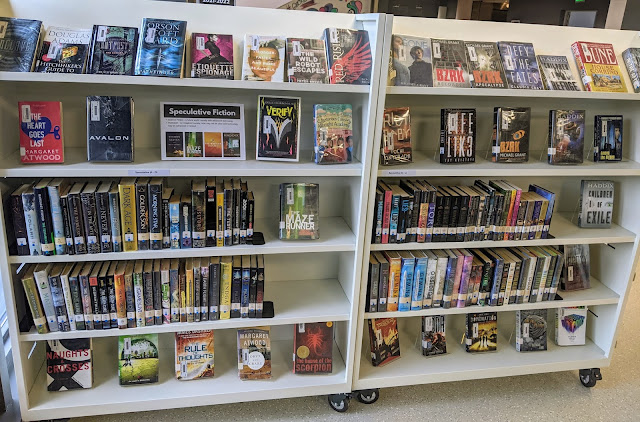
| Shelves "too empty", via Kevin Hennah |
He said, "There's way too much space on those shelves."
I remember thinking, "Huh? No there isn't! That empty space is needed for front-facing books and books that will get returned!""
But no.
I realized he was right.
I realized his style of shelving is possible if I pack the books tighter to create dedicated display spaces, not accidental display spaces. A front-facing book at the end of a row is fine, but it's even better when LOADS of front-facing books are viewed together in a dedicated area. It's purposeful. It has impact. It screams "Grab me!"
After my action research and remembering his comment, I packed my shelves almost full to open more dedicated display space.
Here are some "before and after" photos of our shelving with my new system.
Before, in Realistic Fiction
Shelves are 3/4 full and bottom shelves are empty when possible
After, in Realistic Fiction
Books are packed more tightly to open an entire unit for display and an extra row at the top for more display (slanted top, plus the row underneath, if possible)


No comments:
Post a Comment